As you may have noticed, I’ve rolled out a major update to my blog, including a brand-new theme (source code published on github.)
This change has been a long time coming. I’ve thought about updating my blog and making a new theme for literally years. All that time, my blog’s been using the default Posthaven theme. But not anymore!
In this post, I’ll talk a little bit about what I’ve learned about theme design and how that influenced the design you’re looking at right now.
Design goals
When I’m building a theme from scratch, I use design goals to help me make decisions. Goals are essential for me to have a basis of comparison between different options.
These were my goals this time:
Feels like notes
This blog comes from my notes; reading it should feel like reading technical notes or journal entries. A too-fancy or too-businessy design would give across the wrong impression.
Flat content hierarchy
Posts are stored in a “flat hierarchy,” meaning no categories, sections or sub-posts are used. Posts organized exclusively through tags.
I would like to emulate the org-roam behavior where posts are organized
through arbitrary bidirectional links. But this doesn’t seem to be how Hugo was
designed to work, so I’ve been relegated to tagging.
Content only
This is partly related to the Feels like notes goal. Since a blog post is a
“published note”, there’s simply no reason to include anything in the published
page other than some metadata about the note, and the content itself.
More specifically, I avoided using any lines, colors, shapes, or icons in the theme. Lines were especially avoided — whitespace was used instead.
I do want to incorporate diagrams, images, and icons into the blog, but not as structural elements of the theme.
Easy to read
The number one goal is for the content to be easy to read. Anything that would reduce readability is banned.
When discussing readability, personal taste is certainly a factor. But this goal is predicated on the belief that there is a broad standard of readability most people agree on, and that there are design practices and typography conventions that can improve readability in that general sense.
For example, low-contrast colors should be avoided for body text. Have approximately 60-90 characters per line. Use an adequate font size. etc.
Vertical rhythm
To reinforce the “notes-like feeling”, the elements of the page are given a consistent vertical rhythm.
Basically, we define a standard line-height and make sure all our vertical spacing is defined in terms of that value. This gives an effect similar to writing on a sheet of lined paper.
You can click the text below to add background lines to this page as a demonstration:
Show/Hide Lines (no JS required)
For my theme, I used Gridlover to generate declarations for a layout with base
font size 16px, line height of 1.375rem. and scale factor of 1.618.
Comparison
As I thought about my new theme, I hunted down all the old blog themes I could find.
Unfortunately, some past themes are lost, or too inconvenient to recover. But I did find three old themes. I’ve included them in this post, along with my critiques about them, as examples of how my approach has evolved over time.
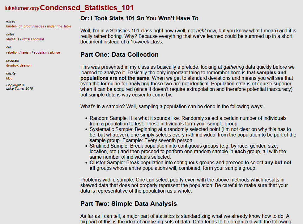
Version 1
I used this Jekyll theme for luketurner.org in 2010-2011, when I graduated high school. Can you tell it’s homemade?
The homepage’s biggest sin is that it doesn’t use whitespace properly. There should be more space between the lines, and the text shouldn’t be crammed in the corner.
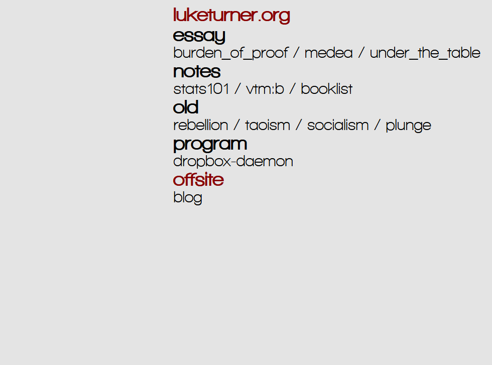
When you view a post, the whitespace problems continue. I think this theme had some interesting ideas, but the inconsistent spacing and formatting makes it look like a hodgepodge.
But actually, I still like this theme a lot. I wouldn’t use it again today, but it’s interesting!
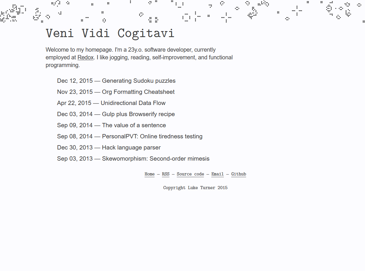
Version 2
This custom theme was published in 2015, also for Jekyll.
The theme’s “eyecatch” was the header, which was a vanilla JS Conway’s Game of Life animation that randomly seeded itself each page-load1.
The theme also heavily used a monospace font called UM Typewriter to give a kind of techie vibe.
Inspired by Tufte CSS, it implemented a “marginalia column” layout, as you can see in the screenshot below. The margin contained tables of contents, metadata, and callouts from the text.
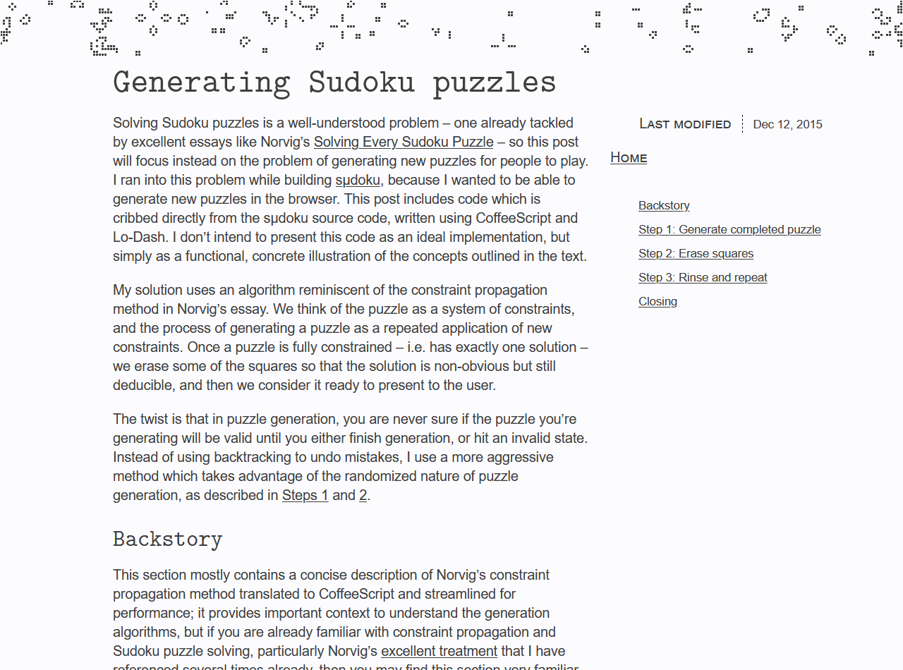
I still like the marginalia idea, and may add it back to my new theme someday. But doing it well can be a challenge and I don’t always want that overhead when writing posts.
A rich variety of formatting was supported, including math, code blocks, tables, etc.
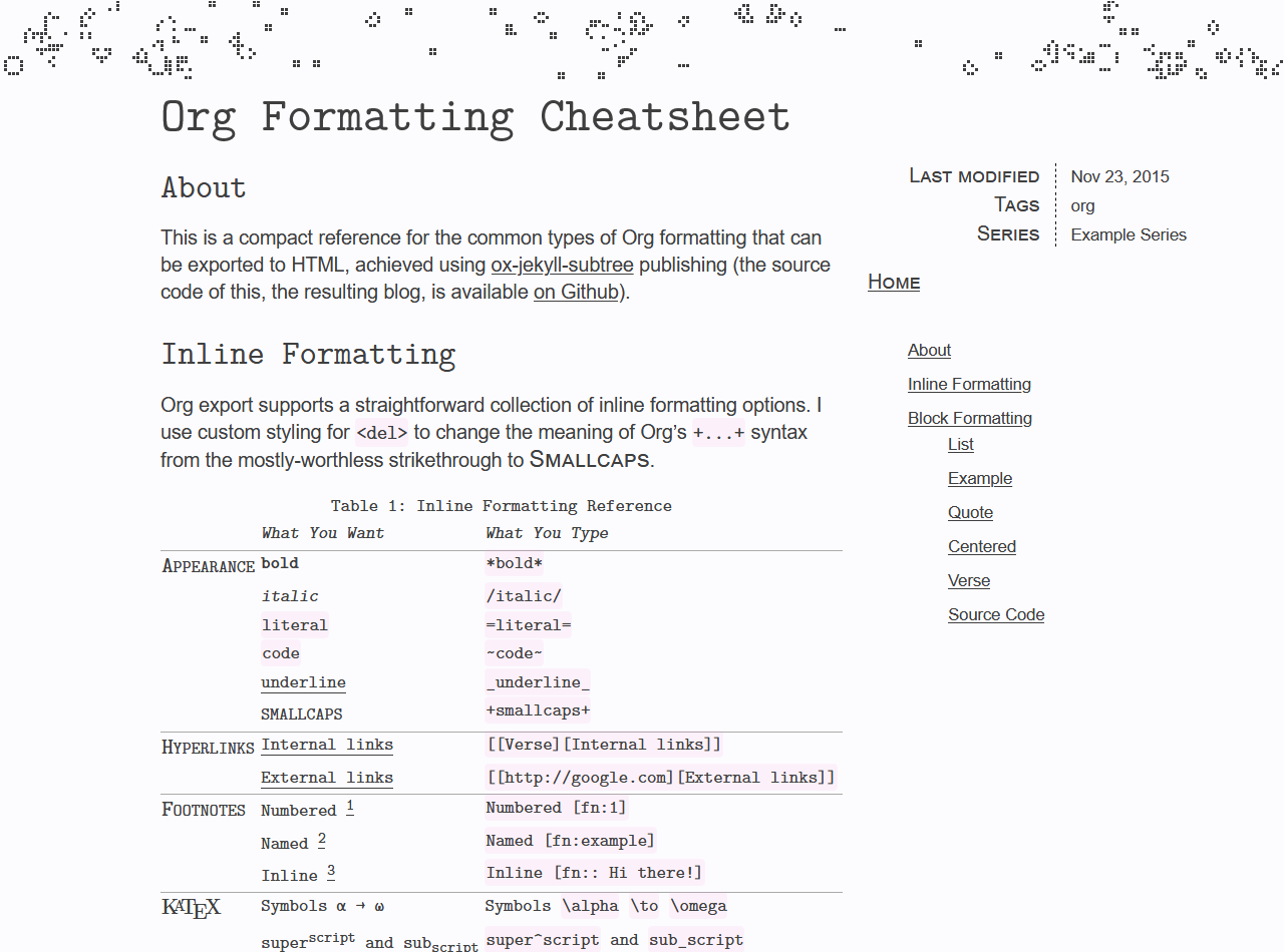
In many ways, I think this was my favorite blog theme I’ve ever used. It had a kind of nerdy, blocky, formatting-rich aesthetic that I associate with awesome sites like Gwern.net.
That’s why I took so much inspiration from it when
building my new theme, including using the same UM Typewriter font.
(Update 2022-11-27 — I’ve since stopped using any custom fonts, since I decided the visual effect did not justify the additional overhead. See 6a8f12a and f854b61.)
I would still be using this today, except for three problems:
- The animated header was a bit too in-your-face. It was cool, but went little contrary to the matter-of-fact, engineering aesthetic I wanted.
- The “marginalia column” layout felt cramped and overcomplicated. It was an interesting experiment, but I decided marginalia should be rare and deliberately out of place, not integrated into the theme.
- The formatting felt too complicated and busy. I think I used too many different formatting styles, lines, etc. to differentiate things. I wanted to maintain a rich array of formatting, but let alignment and whitespace play a bigger role in structuring the page.
Version 3
This one is just the default Posthaven theme. Although it’s certainly more refined than the previous versions, it just didn’t have the features I wanted for writing technical posts.
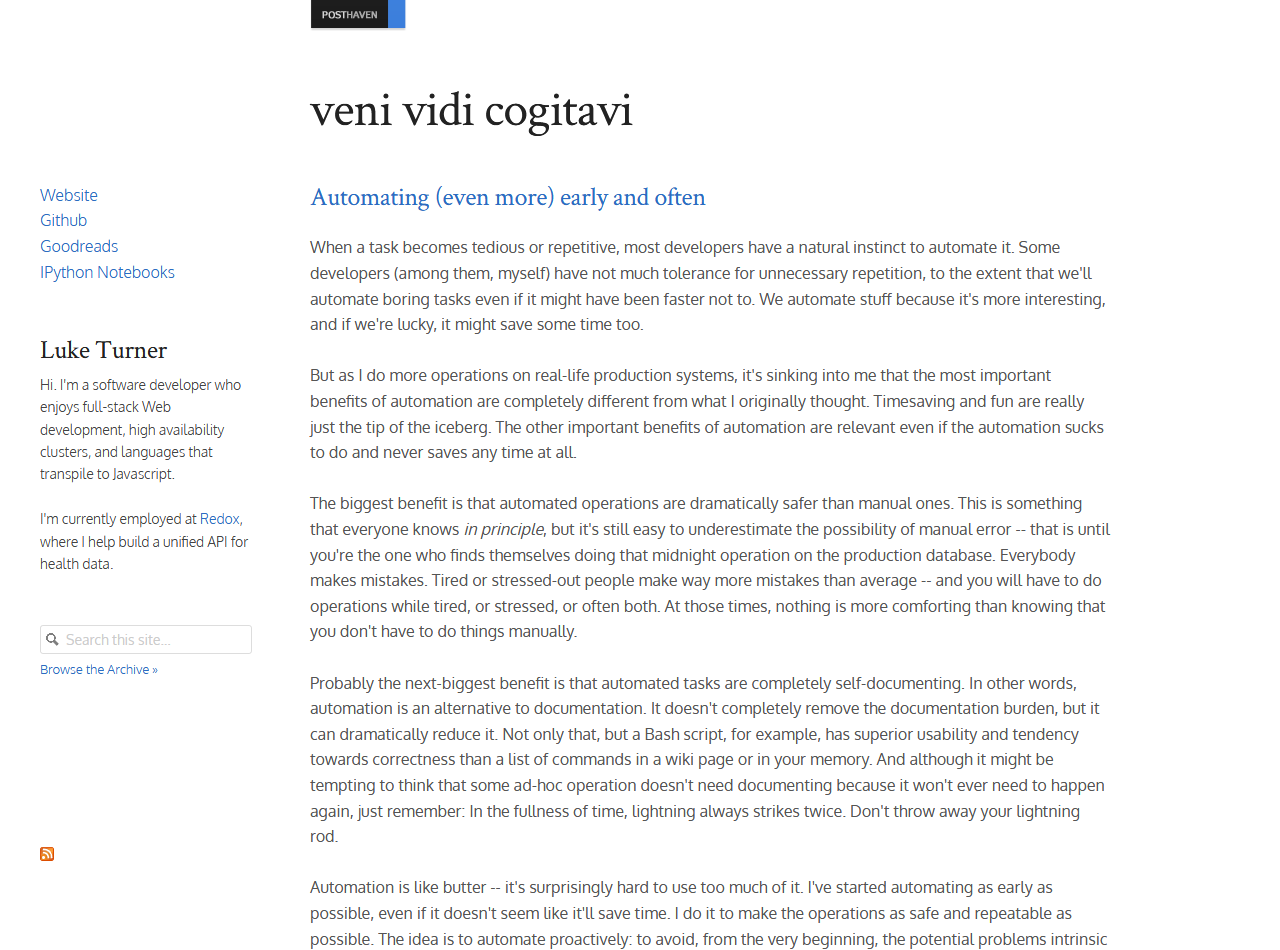
I don’t really have much to say about this, except it has readability and polish but gives the wrong impression for what I want my blog to be. It’s a little too normal!
Footnotes
-
I’ve since implemented a dedicated site with a more fully-featured Conway’s Game of Life implementation: https://luketurner.org/golem/ ↩
